Fortnite’s New Item Shop Layout Sparks Massive Player Backlash
Fortnite’s new ‘Dynamic Categories’ Item Shop update is drawing heavy fire from fans who say the new layout is cluttered and hides daily items.
Epic Games Overhauls the Fortnite Item Shop
Fortnite players woke up to a completely redesigned Item Shop this week, but the reception has been far from celebratory. Epic Games quietly rolled out a major visual and structural overhaul for October 2026, introducing a feature called “Dynamic Categories.” Rather than the organized grid players have relied on for years, the shop now reshapes itself based on user behavior and promotional priorities.
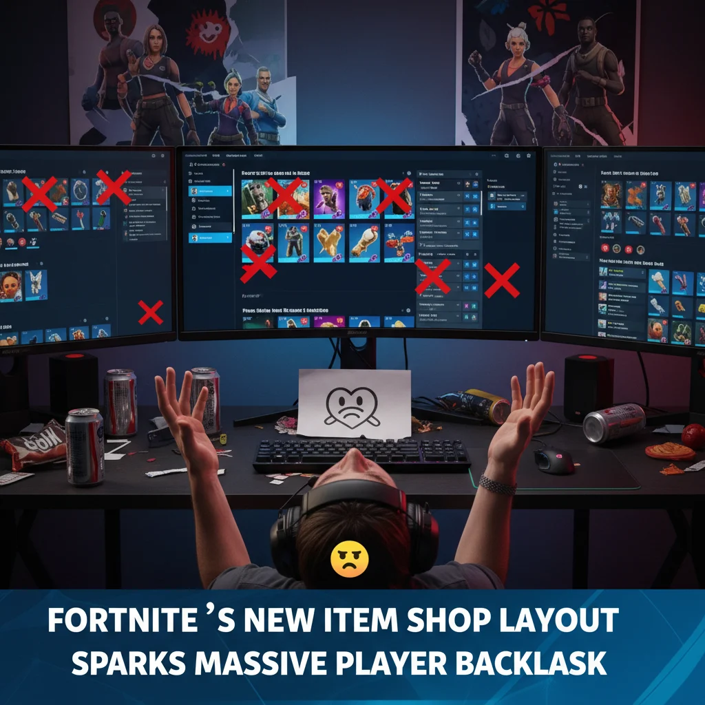
The reaction was instant. And loud. Within hours of the update going live, social media platforms were flooded with complaints. Players are calling the new interface a cluttered, confusing mess that makes finding basic cosmetics harder than ever.
What Are Dynamic Categories?
For years, the Fortnite Item Shop followed a predictable formula. You logged in, scrolled through a few clearly labeled sections like “Featured” and “Daily,” and saw exactly what was for sale. It was simple. It worked.
The new Dynamic Categories system changes all of that. Now, the shop uses algorithmic sorting to rearrange tabs on the fly. If you spend a lot of time playing Rocket Racing or Lego Fortnite, those specific cosmetic categories get pushed to the very top of your shop screen. Meanwhile, the standard daily item rotation is buried deep at the bottom of an incredibly long, vertically scrolling page.
This layout means two players logging in at the same time might see entirely different shop layouts. Epic’s goal seems to be personalization. However, the community feels it is just a way to force-feed collaboration skins and expensive bundles.
The Community Reacts to the Clutter
The biggest complaint from the player base is visual fatigue. The new UI features massive tiles, auto-playing video previews for emotes, and nested menus that require multiple clicks just to view a single skin bundle.

“I spent five minutes today just trying to find the daily emotes,” wrote one frustrated user on the r/FortNiteBR subreddit. “The entire screen is filled with massive blocks for Marvel and Star Wars collabs that have been in the shop for weeks. The actual daily rotation is shoved all the way at the bottom like an afterthought.”
Content creators who cover the game’s daily updates are also feeling the pinch. Many rely on quick, clean screenshots of the shop to share with their followers. With the dynamic layout, capturing the entire shop in one or two images has become nearly impossible.
- Daily rotations are now hidden beneath multiple scroll layers.
- Algorithmic sorting creates different shops for different players, causing confusion.
- Auto-playing media and heavy UI elements are causing menu lag on older consoles.
A Pattern of UI Struggles
This is not the first time Epic Games has faced intense criticism over its user interface decisions. Back at the launch of Chapter 5, Epic completely redesigned the Locker UI, separating character skins, weapon wraps, and lobby tracks into completely different sub-menus. That change was met with near-universal hatred, prompting Epic to issue an apology and promise gradual fixes.
Many players feel the new Item Shop layout is a continuation of that same flawed design philosophy. Critics argue that Epic is prioritizing its expanding multi-game ecosystem—which now includes Lego Fortnite, Rocket Racing, and Fortnite Festival—over a clean user experience.
By turning the Item Shop into a giant, algorithm-driven billboard, Epic is trying to maximize the visibility of its licensed intellectual properties. But for the average player who just wants to hop in, buy a cheap emote, and start a match, the change feels like a massive step backward.
Will Epic Revert the Changes?
So far, Epic Games has kept quiet regarding the backlash. While the developer is known for tweaking features based on community feedback, they rarely roll back major UI overhauls entirely. Instead, players will likely have to wait for incremental updates to clean up the clutter.
For now, the community is loudly demanding a simple fix: a “classic view” toggle in the settings. Whether Epic will grant that wish remains to be seen. Until then, players will just have to get used to a lot more scrolling.